Representing the Structure of Data

To be perfectly honest, I had never thought much about graph layout algorithms. You hit a button in Gephi or call a networkx function, some magic happens, and you get a layout. If you don’t like the layout generated, you hit the button again or call a different function.

In one of my classes last year, we generated our own layouts using eigenvectors of the Laplacian. This gave me a better sense of what happens when you use a layout algorithm, but I still tended to think of it as a step which takes place at the end of an assignment; a presentation element which can make your research accessible and look splashy.

In my visualization class yesterday, we had a guest lecture by Daniel Weidele, PhD student at University of Konstanz and researcher at IBM Watson. He covered fundamentals of select network layout algorithms but also spoke more broadly about the importance of layout. A network layout is more than a visualization of a collection of data, it is the final stage of a pipeline which attempts to represent some phenomena. The whole modeling process abstracts a phenomena into a concept, and the represents that concept as a network layout.

When you’re developing a network model for a phenomenon, you ask questions like “who is your audience? What are the questions we hope to answer?” Daniel pointed out that you should ask similar questions when evaluating a graph layout; the question isn’t just “does this look good?” You should ask: “Is this helpful? What does it tell me?”

If there are specific questions you are asking your model, you can use a graph layout to get at the answers. You may, for example, ask: “Can I predict partitioning?”

This is what makes modern algorithms such as stress optimization so powerful – it’s not just that they produce pretty pictures, or even that they layouts appropriately disambiguate nodes, but they actually represent the structure of the data in a meaningful way.

In his work with IBM Watson, Weidele indicated that a fundamental piece of their algorithm design process is building algorithms based on human perception. For a test layout, try to understand what a human likes about it, try to understand what a human can infer from it – and then try to understand the properties and metrics which made that human’s interpretation possible.

facebooktwittergoogle_plusredditlinkedintumblrmail

Large Graph Layout Algorithms

Having previously tried to use force-directed layout algorithms on large networks, I was very intrigued by

Stefan Hachul and Michael Junger’s article Large Graph-Layout Algorithms at Work: An Experimental Study. In my experience, trying to generate a layout for a large graph results in little more than a hairball and the sense that one really ought to focus on just a small subgraph.

With the recent development of increasingly sophisticated layout algorithms, Hachul and Junger compare the performance of several classical and more recent algorithms. Using a collection graphs – some relatively easy to layout and some more challenging – the authors compare the runtime and aesthetic output.

All the algorithms strive for the same aesthetic properties: uniformity of edge length, few edge crossings, non-overlapping nodes and edges, and the display of symmetries – which makes aesthetic comparison measurable.

Most of the algorithms performed well on the easier layouts. The only one which didn’t was their benchmark Grid-Variant Algorithm (GVA), a spring-layout which divides the drawing area into a grid and only calculates the repulsive forces acting between nodes that are placed relatively near to each other.

For the harder graphs, they found that the Fast Multipole Multilevel Method (FM3) often produced the best layout, though it is slower than High-Dimensional Embedding (HDE) and the Algebraic Multigrid Method (ACE), which can both produce satisfactory results. Ultimately, Hachul and Junger recommend as practical advice: “first use HDE followed by ACE, since they are the fastest methods…if the drawings are not satisfactory or one supposes that important details of the graph’s structure are hidden, use FM3.”

What’s interesting about this finding is that HDE and ACE both rely solely on linear algebra rather than the physical analogies of force-directed layouts. FM3, on the other hand – notably developed by Hachul and Junger – is force-directed.

In ACE, the algorithm minimizes the quadratic form of the Laplacian (xTLx), finding the eigenvectors of L that are associated with the two smallest eigenvalues. Using an algebraic multigrid algorithm to calculate the eigenvectors makes the algorithm among the fastest tested for smaller graphs.

By far the fastest algorithm was HDE, which takes a really interesting, two-step approach. First approximating a high-dimensional k-clustering solution and then projecting those clusters into 2D space by calculating the eigenvectors of the covariance matrix from the clusters. The original paper describing the algorithm is here.

Finally, the slower but more aesthetically reliable FM3 algorithm improves upon classic force-direct approaches by relying on an important assumption: in large graphs, you don’t necessarily have to see everything. In this algorithm, “subgraphs with a small diameter (called solar systems) are collapsed” resulting in a final visualization which captures the structure of the large network with the visual ease of a smaller network.

facebooktwittergoogle_plusredditlinkedintumblrmail

Family Migration

My mother is big genealogy enthusiast. Her enthusiasm, however, is unmatched by many in our family. I mean, we’re glad someone‘s doing the research, but we don’t seem to get that same spark of awe which for her is so inherent to the process.

So she wrote this thing, exploring what we learn from genealogy; the individual effects of the great sweeps of history.

I share it here with permission.

***

Much of what we can know of our ancestors has to be suppositioned by our knowledge of history and prevalent customs of their times.  The lives of most of these people did not make a big splash.  Many were illiterate and, as a result, did not leave much documentation of their experiences.  Life was frequently short due to lack of medical discoveries that are so much a part of our current lives.  But I would suspect that they lived more in the moment than we do now.  So much was out of their control, they had little choice but to focus on the things that were occurring, leaving the rest in the hands of God. Given the difficulties of sustaining life, as an aggregate, what they accomplished was remarkable.

Each era had its own agenda, but the commonalities remained the same for several hundred years of our country’s history. People married young, reproduced prolifically, and attempted to provide for their children.  Many of the accomplishments were a result of this drive. Starting with the Pilgrims and the indentured servants of the South, our ancestors were seeking an environment that would provide opportunities to build lives for themselves and their progeny.  The hardships they endured were more than many of us could even consider, but the conditions that existed in their current lives spurred them forward. Whether it was religious convictions or abject poverty, they all made the leap.  They got on a boat with little real knowledge of what they would meet and forged our future. The heroes are the many people who will never appear on a family tree because they died in the process of trying to reach this goal.  It was the sheer numbers of people who would make this attempt that made our ancestors successful. It created a movement that would be reproduced in 1700’s and the 1800’s and would populate this country with Europeans.

Family life could have many variables, but the notion of childhood is very recent idea. Children were loved and cherished, but expected to participate in sustaining livelihood from a very early age. Frequently their mothers, and sometimes their fathers, were nothing but children themselves. Many people had multiple marriages due to the loss of a spouse. You could not remain unmarried once you had begun family building. It was impossible to continue the care of your children and the growth of your farm without two adults, and, in many cases, young adults to keep up the work. The family home would be small and bursting with people.  Every space would be a bedroom at night.  This caused the older children at a young age to look to new options. Friends and relatives who had moved further west would encourage these young people to join them.  Single men and women would be told that there were many marriageable people waiting to find mates.  Young couples would frequently be intermarried with sisters or brothers of a specific family with the thought that when they emigrated they would remain together. The reality of this westward movement was the disintegration of the original family unit.

Communication would be difficult. In this era of cell phones and e-mail, it is hard to imagine the absolute impossibility of keeping in touch.  Frequently, several siblings would end up in the same location over time.  The first arrivals would help their siblings establish themselves, and then they set to the task of recreating a new network of relations. The ones left at home were usually so young that they had little feeling for their older siblings.  If the family was large enough, another move would be made by the younger children resulting in a separate conglomeration in a new location. Frequently an aged parent would die in the home of a child in the second migration.

There were, of course, some people who remained in the same location generation after generation.  When you reconstruct the families through genealogy, they are our cousins.  Our ancestors were the ones on the move.

facebooktwittergoogle_plusredditlinkedintumblrmail

Design Aesthetic and Chart Junk

In my visualization class today, we had a guest lecture by Michelle Borkin, another Northeastern professor who works in the field of information and scientific visualization. She gave us a great overview of the foundational design aesthetics of Edward Tufte.

Whether you know him by name or not, you may be familiar with some of his principles. He writes extensively about “graphical integrity,” highlighting the importance of clearly labeling of data and cautioning against distorted or misleading axes. But, perhaps more fundamentally, the Tufte-ian mantra seems to be summed in one word: simplify.

Tufte advocates for removing as much extraneous ink as possible. Non-data ink should be minimized as much of possible; clearing away the clutter and letting the data speak for themselves.

Generally, his arguments make sense – there’s no need to create a 3D bar-chart just because Microsoft Office says that you can. But in this day of infographics and data journalism, Tufte’s style can seem rather…dull.

This has led to a great debate over chart junk: a topic so real it has its own wikipedia page. “Chart junk” refers to any element of a visualization which doesn’t explicitly need to be there – elements which may make the visualization more interesting, but which don’t directly convey the data. The term was actually coined by Tufte, who, as you may have guessed, was adamantly anti-chart junk.

Recent research, though, has shown that “chart junk” isn’t necessarily inherently bad. Infographics and other visualizations designed for broad public consumption may not have the precision of a scientific visualizations, but they are more memorable and impactful.

Is chart junk okay? The answer, I guess, depends entirely on the audience, the task, and the context.

facebooktwittergoogle_plusredditlinkedintumblrmail

The Effects of Interactive Latency on Exploratory Visual Analysis

In their paper, Zhicheng Liu and Jeffrey Heer explore “The Effects of Interactive Latency on Exploratory Visual Analysis” – that is, how user behavior changes with system response time. As the authors point out, while it seems intuitively ideal to minimize latency, effects vary by domain.

In strategy games, “latency as high as several seconds does not significantly affect user performance,” most likely because tasks which “take place at a larger time scale,” such as “understanding game situation and conceiving strategy” play a more important role in affecting the outcome of a game. In a puzzle game, imposed latency caused players to solve the puzzle in fewer moves – spending more time mentally planning their moves.

These examples illustrate perhaps the most interesting aspect of latency: while it’s often true that time delays will make users bored or frustrated, that is not the only dimension of effect. Latency can alter the way a user thinks about a problem; consciously or unconsciously shifting strategies to whatever seems more time effective.

Liu and Heer focus on latency effecting “knowledge discovery with visualizations,” a largely unexplored area. One thing which makes this domain unique is that “unlike problem-solving tasks or most computer games, exploratory visual analysis is open-ended and does not have a clear goal state.”

The authors design an experimental setup in which participants are asked to explore two different datasets and “report anything they found interesting, including salient patterns in the visualizations, their interpretations, and any hypotheses based on those patterns.” Each participant experienced an additional 500ms latency in one of the datasets. They recorded participant mouse clicks, as well as 9 additional “application events,” such as zoom and color slider, which capture user interaction with the visualization.

The authors also used a “think aloud protocol” to capture participant findings. As the name implies, a think aloud methodology asks users to continually describe what they are thinking as they work. A helpful  summary of the benefits and downsides of this methodology can be found here.

Liu and Heer find that latency does have significant effects: latency decreased user activity and coverage of the dataset, while also “reducing rates of observation, generalization and hypothesis.” Additionally, users who experienced the latency earlier in the study had “reduced rates of observation and generalization during subsequent analysis sessions in which full system performance was restored.”

This second finding lines up with earlier research which found that a delay of 300ms in web searches reduced the number of searches a user would perform – a reduction which would persist for days after latency was restored to previous levels.

Ultimately, the authors recommend “taking a user-centric approach to system optimization” rather than “uniformly focusing on reducing latency” for each individual visual operation.

facebooktwittergoogle_plusredditlinkedintumblrmail

Democratic Distributions

Gaussian, Poisson, and other bell-shaped distributions are some times called “democratic.” This colloquial term is intended to indicate an important feature: an average value is a typical value.

Compare this to heavy-tailed distributions which follow generally the so-called 80/20 rule: 80% of your business comes from 20% of your clients, 80% of the wealth is controlled by 20% of the population. Indeed, this principle was originally illustrated by Italian economist Vilfredo Pareto when he demonstrated that 80% of the land in Italy was owned by 20% of the population.

In these distributions, an average value is not typical: the average household income doesn’t mean much when a small group of people are vastly more wealthy than the rest. This skew can be shown mathematically: in a bell curve, the variance – which measures the spread of a distribution – is well defined, while it diverges for a heavy-tailed distribution.

Yet while heavy-tailed distributions are clearly not democratic, I’m still struck by the use of the term for normal distributions. I’m not sure I’d call those distributions democratic either.

I’m particularly intrigued by the use of the word “democratic” to nod to the idea of things being the same. Indeed, such bell-shaped distributions are known primarily for being statistically homogeneous.

That’s starting to border on some Harrison Bergeron imagery, with a Handicapper General tasked with making sure that no outliers are too intelligent or too pretty.

That’s not democratic at all. Not really.

This, of course, leads me to the question: what would a “democratic” distribution really look like?

I don’t have a good answer for that, but this does raise an broader point about democracy: most real-world systems are heavy-tailed. Properties like hight and weight follow normal distributions, but power, money, and fame are heavy-tailed.

So the real question isn’t what a democratic distribution looks like; it is how do we design a democratic system in a complex system that is inherently undemocratic?

facebooktwittergoogle_plusredditlinkedintumblrmail

Gestalt Principles

In Parts I and II of Gestalt Principles, Bang Wong describes core elements of Gestalt psychology, a 1920s German theory of “how people organize visual information.” The German term Gestalt means shape or form. As Wong summarizes in Part II, “our visual system attempts to structure what we see into patterns to make sense of information.” In other words, we naturally and reflexively process visual input by attempting to group objects into “unified wholes.”

In Part I, Wong explores the principles of similarity, proximity, connection and enclosure. “The fundamental concept behind these principles is grouping;” he argues. “We tend to perceive objects that look alike, are placed close together, connected by lines or enclosed in a common space as belonging together.” Color schemes, visual clustering, and lines on a graph are all tools which can differentiate datasets.

In Part II, he examines the principles of visual completion and continuity:  “Because we have a strong tendency to see shapes as continuous to the greatest degree possible, we fill in voids with visual cues found elsewhere on the page.” This principle has an important implication: “every element on a page affects how we perceive every other element.”

Wong presents all these principles as helpful design tools which can leverage human mental processing in order to present data clearly.

What’s missing from these short essays, however, is any discussion of possible misuse of these design principles. Presumably, an altruistic designer would solely use these tools to “let the data speak for itself;” using Gestalt principles to highlight and clarify the ground truth which is already there.

But this seems to gloss over an important detail: all design choices are choices. Even putting aside the occasional malicious designer, who deliberately presents a warped visualization in order to leave viewers with an erroneous impression; it seems entirely possible that a lazy designer could accidentally imply something unintended, or that a researcher could be mislead by the Gestalt of their own visualization.

Furthermore, while these principles may be the simplest way to communicate data, there is no discussion of whether they are the right way to communicate data.

Last semester, Lauren Klein of Georgia Tech gave a talk at Northeastern in which she highlighted the visualization work of Elizabeth Peabody. Remembered primarily as an educator, Peabody created of elaborate mural charts of history, intended to provide historic “outlines to the eye.” Her work was intentionally complex and difficult to engage with; people had to interact with it to understand it. In the mid-1800s, this approach pushed the question who is authorized to produce knowledge? And subversively answered: everyone.

So Gestalt principles may make it easier to process information, but it should also be acknowledged that this may diminish the agency of the viewer – whose brain reflexively interprets visual stimuli in a given way, even if it’s not accurate and even if they know it’s not accurate.

At the beginning of the two articles, Wong quotes founding Gestalt scholar Kurt Koffka, in saying “The whole is ‘other’ than the sum of its parts.” While this is sometimes translated as “greater than the sum of its parts,” Wong is clear that this was not Koffka’s meaning: “the emergent entity is ‘other’ (not greater or lesser) than the sum of the parts.”

This quote highlights the need to think more robustly of the experience of the viewer. The design that is created, the visualization that expresses some aspect of the data, is a new thing, other than what existed before. Peabody’s visualizations were exhaustingly interactive, but they did invite the viewer to become an active participant in the act of creating this other.

facebooktwittergoogle_plusredditlinkedintumblrmail

Civic Humility

As I’ve written before, I am generally annoyed by the concept of the so-called “confidence gap” – or perhaps just annoyed by the common prescription. If you’re not familiar with the term, the confidence gap refers to a gendered divide in individual confidence levels. Or more precisely, the idea that women are less confident than men.

Various studies reinforce the existence of this phenomenon, indicating that – while of course there is a great deal of individual variation – women are generally socialized to believe that their voices and perspectives don’t matter. In an interesting correlation, this is probably because, for many women, it is continuously made clear to them that their voices and perspectives don’t matter.


Numerous programs aimed at increasing the confidence of these wayward women seek to address this problem.

In my mind, I imagine the advertisement: you too, can be an arrogant blowhard.

These efforts are well intentioned, no doubt, but I always have to greet them with a sigh.

First, the existence or non-existence of an individual’s confidence is mostly likely a complex interplay of a number features, among which gender is one. To the extent that it is a gendered phenomenon, it is related not only to the socialization of women, but to the socialization of men.

Rather than asking “how can we increase women’s confidence?” I’m more interested in the deeper question, “how can we ensure [all people’s] voices are actually heard?”

But more fundamentally, the idea of confidence just annoys me. I don’t want to be confident in the way many confidence gap enthusiasts talk about confidence. Sometimes I wish the confident person who doesn’t know what they’re talking about would just shut their mouth. I want it to be okay to not know an answer.

More importantly, I want it to be okay for people to make space for each other’s ideas.

In many deliberative settings there’s a concept of “step up/step back.” This expression captures both what one might call confidences as well as what I can only call civic humility.

If you haven’t added your voice and perspective you have a duty to do so. I’ve you’d added a lot of your voice and perspective, you have a duty to create space for others.

Civic humility, though, is more than simply stepping back from dominating the verbal space. It is the active mentoring and nurturing of the voices of those around you – creating space for them and actively seeking and valuing their participation.

I call this humility civic, because I see it as an intrinsically associated phenomenon. In the Good Society, people don’t just try to yell their ideas loudest, constantly preening for attention; they work together, co-creating something better than they could have developed through a mere aggregation of opinions.

Civic humility, I would argue, is needed beyond the scope of any current systemic injustice. In a perfectly egalitarian world, there will still be people who are faster to speak while others take time to process. There will always be power imbalances – between people of different ages, or people of different technical expertise.

The art of associated living is not only one of speaking up and making your voice heard, but it is fundamentally one of making space for the contributions of those around you.

facebooktwittergoogle_plusredditlinkedintumblrmail

On Bad Public Meetings

There are two divergent visions conjured by the idea of a “public meeting.”

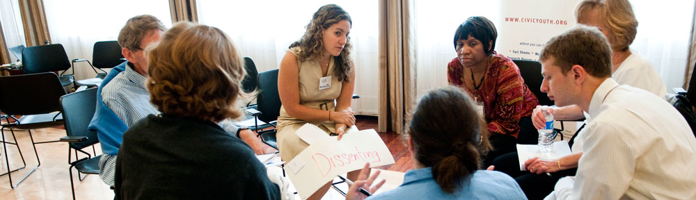
First, there’s the ideal: a rich discussion of views and values; a robust exploration of a problem and collective reasoning about solutions; diverse communities thoughtfully engaging together in the hard work of associated living. Such a public meeting is not unlike an idealized college seminar – everyone contributes, everyone grows, and the co-created output of this public work is far better than anyone would have created on their own.

Then there’s the all too common reality; the reason so many of us avoid public meetings in the first place. The inefficient use of time, the yelling, the talking over and past each other, and – if you have the same pet peeves I do – the people who seem to feel the overwhelming need to hear the sound of their own voice, who feel compelled to speak before taking the time to consider what value they are adding to the conversation.

My friend and civic colleague Josh Miller recently pointed me to one such epitome of terrible public meetings, captured in the Milwaukee Record under the headline Lake Park’s Pokemon Go Meeting Was Boring, Livid, and Gloriously Absurd.

To be fair, those adjectives could easily be used to describe many public meetings on a wide variety of topics.

As author Matt Wild described, “Yes, last night’s meeting was the sound of a ridiculous situation taken to its ridiculous extremes. It was the sound of two sides possessing both reasonable concerns and defiant inabilities to listen to one another. It was the sound of privileged people droning on and on and on. It was the sound of people who always seem to have obnoxious Qs during Q&As asking those obnoxious Qs.”

I can’t tell you how many public meetings I’ve been to in my life which fit that description.

So perhaps it seems strange that I cling to the ideas of collaborative public work, of productive public dialogue. Perhaps such an idyllic vision is too much to ask for and far too much to expect: after all, let’s not pretend that those leafy college seminars always go off without out a hitch.

And I make no denials that such a vision of public collaboration is hard. It is very hard. That is, perhaps, why Harry Boyte’s term of public work seems so apt even for the process of dialogue. Real deliberation is work.

But I find it a noble effort; a work worth engaging in even if the results come up short.

We must then ask ourselves – why do so many public meetings go so horribly awry?

For one thing, we must think carefully about the structure of such meetings. The common structure of most public meetings is designed to maintain the power of public officials. Public officials discuss, deliberate, invite expert testimony, and finally, in a nod to democracy, allow for public comments. Then the officials discuss and deliberate further – putting the matter to a vote or requesting further study of the issue at hand.

“The public” does not attend with the role of deliberator or authority, but is relegated to 60 minutes of anecdotes no one really wants to listen to.

There are reasons this structure might be good – society must be protected from the “trampling and the roar of the bewildered herd,” as Walter Lippmann wrote. Perhaps it is wise not to give “the public” too much power.

And while I would far prefer to see public meetings which truly embraced the role of the public – which invited residents as stakeholders and experts to talk together and collaborative address public problems – the current model seems like possibly the worst of all worlds.

Wild describes the many failures of the Pokemon Go meeting:

The meeting was clearly flawed, with far too much time given over to the panel members, and precious little time given to concerned Pokemon players. If more minutes had been dedicated to audience remarks and general Q&A, perhaps the pro-Pokemon contingent would have gotten their cries of “I LOVE POKEMON AND THIS IS BRINGING PEOPLE TOGETHER” out of the way and focused on the main problem at hand: How does a residential park that wasn’t designed to handle thousands of people congregating in a relatively small space seven days a week for three months straight suddenly handle thousands of people congregating in a relatively small space seven days a week for three months straight?

Urban planner Bent Flyvbjerg argues that “power is knowledge,” that “power defines what counts as knowledge and rationality, and ultimately…what counts as reality.” This observation comes precisely from his work in public space planning: decisions are made, implicitly or explicitly, behind closed doors and public information is shaped and shared in such a way as to create the illusion of public participation while ensuring the outcome preferred by those with power.

This dynamic creates a self-enforcing cycle of public disaffection and civic defeat. As Lippman argued in 1925, “the private citizen today has come to feel rather like a deaf spectator in the back row …In the cold light of experience he knows that his sovereignty is a fiction. He reigns in theory, but in fact he does not govern…”

And thus we find ourselves with disastrous Pokemon Go meetings, with enumerable public meetings in which a disaffected public rouses itself to share various concerns, where some find it to be their duty to speak out, to try to engage in the process, while the rest of us sitting at home – reading the recap in the local paper, rolling our eyes, and wondering with a discontented sigh, where did it all go wrong?

facebooktwittergoogle_plusredditlinkedintumblrmail

Analytic Visualization and the Pictures in Our Head

In 1922, American journalist and political philosopher Walter Lippmann wrote about the “pictures in our head,” arguing that we conceptualize distant lands and experiences beyond our own through a mental image we create. He coined the word “stereotypes” to describe these mental pictures, launching a field of political science focused on how people form, maintain, and change judgements.

While visual analytics is far from the study of stereotypes, in some ways it relies on the same phenomenon. As described in Illuminating the Path, edited by James J. Thomas and Kristin A. Cook, there is an “innate connection among vision, visualization, and our reasoning processes.” Therefore, they argue, the full exercise of reason requires “visual metaphors” which “create visual representations that instantly convey the important content of information.”

F. J. Anscombe’s 1973 article Graphs in Statistical Analysis makes a similar argument. While we are often taught that “performing intricate calculations is virtuous, whereas actually looking at the data is cheating,” Anscombe elegantly illustrates the importance of visual representation through his now-famous Anscombe’s Quartet. These four data sets all have the same statistical measures when considered as a linear regression, but the visual plots quickly illustrate their differences. In some ways, Anscombe’s argument perfectly reinforces Lippmann’s argument from five decades before: it’s not precisely problematic to  have a mental image of something; but problems arise when the “picture in your head” does not match the picture in reality.

As Anscombe argues, “in practice, we do not know that the theoretical description [linear regression] is correct, we should generally suspect that it is not, and we cannot therefore heave a sigh of relief when the regression calculation has been made, knowing that statistical justice has been done.”

Running a linear regression is not enough. The results of a linear regression are only meaningful if the data actually fit a linear model. The best and fastest way to check this is to actually observe the data; to visualize it to see if it fits the “picture in your head” of linear regression.

While Anscombe had to argue for the value of visualizing data in 1973, the practice has now become a robust and growing field. With the rise of data journalism, numerous academic conferences, and a growing focus on visualization as storytelling, even a quiet year for visualization – such as 2014 – was not a “bad year for information visualization” according to Robert Kosara, Senior Research Scientist at Tableau Software.

And Kosara finds even more hope for the future. With emerging technologies and a renewed academic focus on developing theory, Kosara writes, “I think 2015 and beyond will be even better.”

facebooktwittergoogle_plusredditlinkedintumblrmail